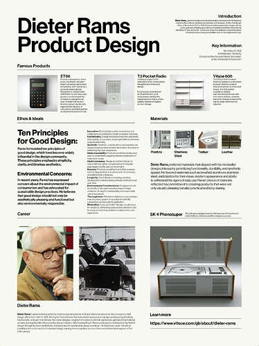
There are certainly even more specific principles for screen design, but as a first universal contribution, the 10 design principles of classical designer Dieter Rams should be able to serve as food for thought for further design:
Hey JamO,
while I’m at it, here comes another little proposal on MG visuals. Please remember, I do not mean to criticize your hard and excellent work but to make suggestions.
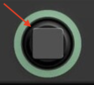
This presentation of a switch is literally “a square peg in a round hole“. The square-within-a-circle-thing doesn’t reflect the look of a real-world switch whereas all other UI elements do represent their real-world counterparts visually. And that is a distraction.
My suggestion: Make it a circle (I have an idea why you didn’t) and use a more chrome-like metallic gradient for the switch so it looks differently to the knobs.
Hell, yeah! Much better, thanks.
Ich finde es besser, wenn der Schalter eckig bliebe und so sich von der Formensprache eindeutig von einstellbaren Reglern abhebt, d.h. im live betrieb auch schneller erkennbar ist, unabhängig von der (vielleicht nicht so schönen) Schattierung.
Im Übrigen könnte man den globalen (eckigen) Schalter der Chain auch gleich z.B. links oben oben in die Zeile “Chain” einfügen und so Platz gewinnen für weitere Einträge in die Chain selbst. Wenn mann noch mehr Platz sparen wollte, könnte man den Schalter oben in der Chain auch leuchten lassen bei Betrieb der Chain.
I am no designer, but I do have a feeling that current fonts are somehow working against my perception effeciency.
I am glad that somebody qualified could bring up this topic.
Yet one more suggestion:
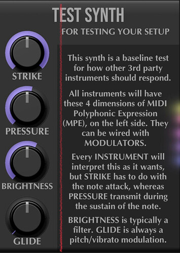
Center-aligned text looks like a poem (or, to be sarcastic, like a gravestone inscription). Make it left-aligned and readability increases. Looks more contemporary, too. If possible, align the title lines with the descriptive text.
For purely technical scientific texts, left-aligned captions are certainly standard.
Centred short texts look more like a poem. Such texts can certainly reflect the sculptural character of your product.
And yes, this fits well with a product that also has a certain aesthetic appeal in addition to its functionality, especially because it is supposed to be an artistic tool for artists ![]()
Not sure Dieter Rams would agree. Check his second and third principle for good design.
My stance: There is a place for decoration and also for irrationality. Musical instruments and gear are not least about attitude. If you go this route, make it big, bad and bold. Center-aligned descriptive texts don’t fit the bill.
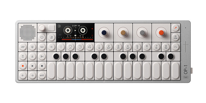
Concerning Rams‘ design applied to electronica: I think, Teenage Engineering does a decent job of combining retro-futuristic minimalism and functionality with playfullness a.k.a. a certain aesthetic appeal.
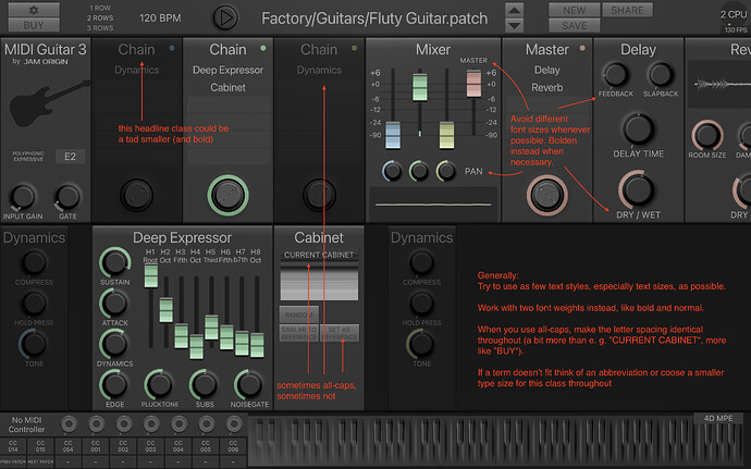
Check my screenshot with remarks, JamO.
I use one font throughout, SF (San Francisco) here. The font chooser doesn’t let me specify the font weight, however. Instead it uses the default weight, which would not have been my preference. I’d make the headline styles bold and probably a tad smaller. For my other suggestions please see my screenshot.
